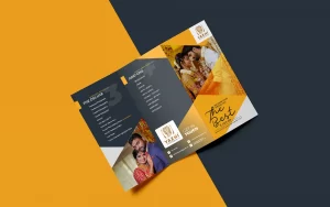
As a business owner, one of the essential tools you need to promote your products or services is a brochure. A brochure can help you communicate your brand message, introduce your business, showcase your products or services, and increase your sales. However, creating a brochure design that stands out can be a daunting task. You need to create a design that captures your target audience’s attention and conveys your brand message effectively. In this article, we will give you ten tips for creating eye-catching brochure designs that stand out.
1. Define Your Objectives
Before you start designing your brochure, you need to define your objectives. What do you want to achieve with your brochure? Do you want to introduce your business, showcase your products or services, or increase your sales? Once you define your objectives, you can create a design that aligns with your goals.
2. Know Your Target Audience
Your brochure design should speak directly to your target audience. You need to know your target audience’s demographics, interests, and pain points to create a design that resonates with them. Knowing your target audience will also help you choose the right images, colors, and fonts.
3. Keep it Simple
A cluttered brochure design can be overwhelming and confusing. Keep your design simple and straightforward. Use minimal text and images, and make sure your brochure is easy to read and understand.
4. Choose the Right Colors
Colors play a crucial role in your brochure design. Choose colors that align with your brand message and evoke the right emotions. Use contrasting colors to make your design pop, and avoid using too many colors that can be distracting.
5. Use High-Quality Images
Images can make or break your brochure design. Use high-quality images that showcase your products or services in the best light possible. Avoid using stock images that look generic and unoriginal.
6. Use a Strong Call to Action
Your brochure design should include a strong call to action that encourages your target audience to take action. Whether it’s visiting your website, calling your business, or making a purchase, your call to action should be clear and compelling.
7. Choose the Right Fonts
Fonts can have a significant impact on your brochure design. Choose fonts that align with your brand message and are easy to read. Use different font sizes to create hierarchy and make your design more visually appealing.
8. Use White Space
White space, also known as negative space, is the empty space around your design elements. Using white space can make your design look more polished and professional. It can also help your target audience focus on the essential elements of your brochure.
9. Consider Your Brochure Format
There are several brochure formats to choose from, including bi-fold, tri-fold, and gatefold. Choose a format that aligns with your brand message and objectives. Consider the amount of information you want to include and the size of your brochure.
10. Hire a Professional Designer
Creating an eye-catching brochure design takes time, skill, and experience. If you’re not confident in your design skills, consider hiring a professional designer. A professional designer can help you create a design that stands out and captures your target audience’s attention.
In conclusion, creating an eye-catching brochure design that stands out takes time and effort. You need to define your objectives, know your target audience, keep your design simple, choose the right colors, use high-quality images, use a strong call to action, choose the right fonts, use white space, consider your brochure format, and hire a professional designer.
By following these ten tips, you can create a brochure design that effectively communicates your brand message, showcases your products or services, and increases your sales.


